Too light, or too vivid?
Squint at the mix next to the color you want. Squinting hides detail and saturation and leaves mostly light and dark. If the two still look different, the problem is lightness. If they look the same when you squint but the mix jumps out when you open your eyes, it is too vivid.
A black-and-white photo on your phone does the same job. If the two match in gray, only the intensity needs work.
Too vivid: add a little of the opposite color
Colors opposite each other on the color wheel cancel each other out. A small amount of the opposite color lowers the intensity of a mix without moving it much in lightness. Earth colors are a handy shortcut. Burnt sienna and burnt umber are dull oranges, so they calm blues and greens, and they are often already on the palette.
| If the mix is too vivid and… | Add a little |
|---|---|
| Green | Red or burnt sienna |
| Blue | Orange, burnt sienna or burnt umber |
| Red | Green |
| Orange | Blue |
| Yellow | Violet, or a touch of yellow ochre |
| Violet or purple | Yellow or yellow ochre |
Add it in small steps
It takes very little. Pull a small amount of the mix aside, add the opposite color with the tip of the knife, and compare again. When the test pile is right, repeat it in the main batch. Too much tips the mix past neutral and toward the other color, and that is harder to undo than adding a second small amount.
Why not just add black or gray?
Black does lower intensity, and in small amounts it works. It is very strong, though, it darkens the mix at the same time, and with yellows it shifts toward green. Gray made from black and white changes the lightness too. The opposite color changes intensity most and lightness least, which is usually what “too bright” needs.
Too light: add more of the color
If the mix is too light, add more of the main color or a darker paint of the same family, such as burnt umber into a brown or ultramarine into a blue. Then check intensity again, because darkening can change it.
Sources and further reading
Lightness, strength and hue, checked one at a time
PaintCue compares your mix with the color you want and reports lightness, strength and hue on their own lines, so you know which problem you have. Then it names one paint to add next and why, using only the paints you own.
iPhone and Android · English and 简体中文 · Works offline
See how PaintCue works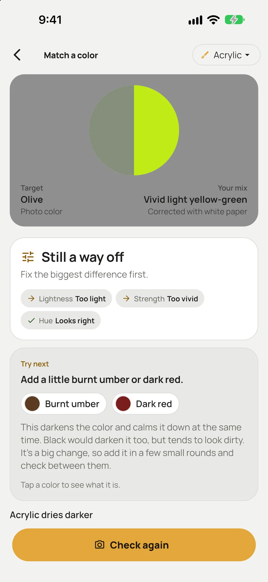
Questions
How do I make a paint color less saturated?
Add a small amount of its complement, the color opposite it on the color wheel: red for green, orange for blue, violet for yellow. Earth colors like burnt sienna and burnt umber are a gentle way to calm blues and greens.
Does adding white make a color less bright?
It makes it lighter and paler, which can look less bright, but it also cools many colors and can look chalky. If the mix is the right lightness and only too intense, use the opposite color instead.