Start from yellow and blue, and choose them on purpose
The yellow and blue you pick decide how bright the green can get. A clean lemon yellow with a greenish blue gives the brightest greens. An earthy yellow, a warm blue, or a dark like burnt umber pulls the mix toward olive and moss before you add anything else.
Ultramarine is a good blue for natural greens because it leans slightly toward red. Yellow ochre is already a muted yellow, so ultramarine and yellow ochre give a soft olive almost at once.
| Green | Start with | Then |
|---|---|---|
| Olive | Yellow ochre and a little ultramarine | Add a touch of burnt umber for a deeper olive |
| Moss | Cadmium yellow and ultramarine | Calm it with a little burnt sienna |
| Sage | Olive, plus white | A tiny bit of red if it turns minty |
| Shadow or forest green | Ultramarine and burnt umber | A little yellow until it reads as green |
| Yellow-black olive | Yellow and a very small amount of black | Add the black a speck at a time |
Calm a bright green with red
Colors opposite each other on the color wheel lower each other’s intensity. Red sits opposite green, so a small amount of red, or burnt sienna, which is a dull orange-red, takes the electric edge off a tube green and keeps it looking like a green.
Add it in small steps. Red has a lot of tinting strength, and too much turns the green brown or gray. Mix a small test pile at the side of the palette before you change the whole batch.
Be careful with white
White lightens a green but also makes it cooler and chalkier. If you want a lighter olive, try a little more yellow or yellow ochre first and save white for the last step. For sage and other gray-greens, white is right, because sage is a pale, quiet green.
Check it the way it will be seen
Acrylic looks lighter while it is wet and darker once it dries. Put a dab of the mix on the same surface you are painting on, let it dry, and compare it next to the color you are matching. Do the comparison under the light you paint in.
Sources and further reading
Let PaintCue say what’s off
Take a photo of the green you want and one of your mix. PaintCue compares the two and tells you whether the mix is lighter or darker, too vivid or too dull, and which way the hue leans, then names the paint to add next from the paints you own.
iPhone and Android · English and 简体中文 · Works offline
See how PaintCue works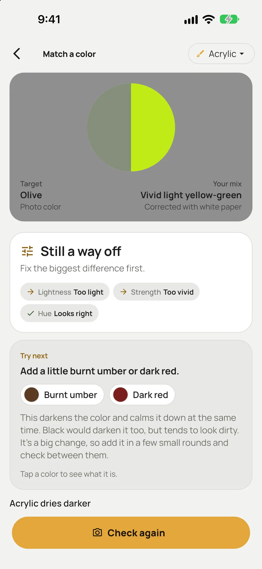
Questions
Why does my green look fake?
Usually it is too vivid. Greens in nature are muted, and tube greens like phthalo or permanent green are among the brightest paints you can buy. Calm them with a little red or burnt sienna, or mix your green from a duller yellow and blue.
Can I use black to mute a green?
Yes, in small amounts. Black with yellow makes a useful olive. Black is strong, though, and also darkens the mix, so add it a speck at a time. If you want the green duller but not darker, use red or burnt sienna instead.